Sometimes you have to supply a picture of yourself in the studio. Of course you want this image to represent both you and your studio in the best way, but that's not so easy. Today Bonnie, my official photographer, and I went to the studio to get an image I could use for a couple of requests. Here are a few of the rejects and the one success that I'm including for your consideration. (Of course I'm not showing you the ones that were so bad that I deleted them. These are just bad enough to learn from.)
 |
| Image #1 - REJECTED |
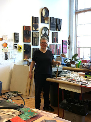
Image #1 - I wanted to show some things in the foreground that I work with and in the background some of my work. Why it was rejected: I am too far away from the camera, there is old work in the background, and the work is lined up with my head, materials in foreground are too random and unidentifiable. It looks too cluttered.
 |
| Image #2 - REJECTED |
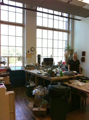
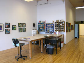
Image #2 - I wanted to show that this was a large space, well lit and that I had plenty of room to work. Instead I look like an ant in the corner - who is that over there? Too much stuff on the tables and the floor. A big trash can is right in the foreground.
 |
| Image #3 - REJECTED |
This is closer to me so it's a little better because at least you can see that it's me. I like seeing the work behind me, but what's all that stuff in the foreground? Looks messy. Do I want to show off the diet Polar drink and handiwipes? Am I a painter or a carpenter?
 |
| Image #4 - REJECTED |
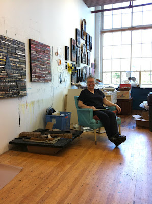
Too much dirty floor, shot into the window so details are lost.
 |
| Image #5 - REJECTED |
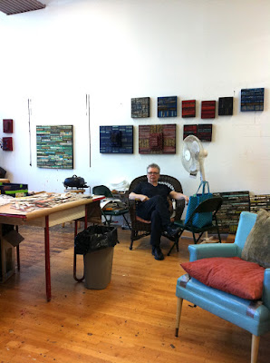
Who is that over there? Why are they showing off the chair, the fan and the trash can - not to mention that dirty floor again?
 |
| Image #6 - REJECTED |
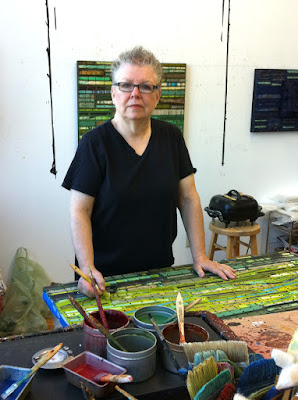
This shot is better because it shows the encaustic set-up in the foreground and me supposedly working on a panel, but did I lose my best friend?
 |
| Image #7 - ACCEPTED |
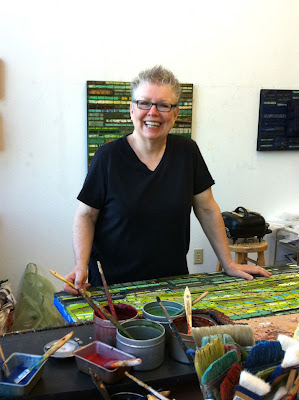
OK, this is the one. I like the set up, I'm smiling, the work shows in front of and behind me. I wish you could see more of the work on the wall, but at least you can get a hint of it. I would also have preferred it without those black lines of paint on the wall, but that's what's there.
----------------------------------------------------------------------------
ADDENDUM
With emphasis on the "DUM(B)"
 |
| Image with no black lines |
Thanks to friend, blog reader and Photoshopper Linda Cordner, I no longer have black lines on my wall in the accepted image! Somehow I never remember that reality can always be improved through the magic of Photoshop. This is a big improvement, I think. (Also thanks to Karen Jacobs for pointing out that the clone tool works wonders.) Much better!
---------------------------------------------------------------------------
We also made a short video in the studio this morning. I was able to download it from the iPhone to the computer but getting it from the computer to the blog was beyond me. I guess I need to find a 15-year-old to educate me.
Now where's the reader who knows how to load a video?




14 comments:
Great choice of images. Such a challenge to find an image we feel good about when its us and our art. BTY, your floors look fine to me!
Thanks for showing the rejects too, great shot of you.
Those black lines can be easily photoshopped away... the clone brush running down the side of the line so it repeats the changes in value of the wall. Great photo!
I am soooo with you! It is crucial to have good studio shots but (for me) it is very hard to be on the 'other side' of the camera. You chose well, my friend.... you look mahvelous!
Thanks for this post Nancy. I'm currently working with classes on making choices and decisions for portfolios and presentations. You give a good step by step of the problem and a final solution.
Nancy, you started out by making the wisest decision possible: having someone you know and trust (and preferably love!) take the pictures! That way, you relax and feel open toward the camera (i.e. you think of it as the person you know, not a camera), and end up looking natural instead of stiff or like a deer in the headlights. Well done, both of you!
Thanks for your comments, everyone! I appreciate your helpful hints and insights.
Excellent photo with excellent use of Photoshopping. Your step by step was excellent. A shout out to Bonnie, the official court photographer.
What a humorous post; and this whole photo collection indeed gives a very good impression of your fantastic studio.
Can't see a "dirty" floor - just lots of space, light, things going on. And, yes, the last pic of you is definitely the best one - lovely and charming.
Only a shame that one cannot see the entire painting behind you.
This is a fun post! Thanks to Linda — I was just going to ask you to get rid of those black lines too! Plus you're looking quite svelte these days!
I too didnt find the floor "dirty."
The thing about the chosen image is you are smiling and that is nice.
it is very hard to get a good picture on oneself. also though it is nice to see your studio from various angles. thanks for sharing the process!
One of the many advantages of digital photography--since you can see the image right away, it is readily apparent when you need to keep shooting. As for getting the best arrangement of stuff amid the clutter of a working studio, it helps to 'style' the shot (something I learned years ago from my photographer husband). You picked a great photo, and I look forward to seeing the video.
Love the post, I giggled out loud at your comment about looking like you lost your friend. The choosen photo is beautiful.
Dear Nancy,
I just came her via the mysterious ways of internet...I was doing some research on Betye Saar....
I find your work very interesting and beautiful,and your post presenting pictures of you made me laugh a lot:) Thanks so much for sharing these imagines and your art, I'll be back. Oh I also liked your article about Lee Krasner and Joan Mitchell ! It made me think of something, de Kooning reportedly once said to his (artist!)-wife when neither of them wanted to do the housecleaning : "We need wives". It is still like that today and that sometimes unfuriates me.:) sorry for ranting here lol. Greetings from Paris, have a wonderful weekend, Andrea
Post a Comment