|
| The Bing at night, photo by Chris Marion Photography, from The Bing's website |
Money Changes Everything
Remember that song by Cyndi Lauper? Well, here's how the grant influenced me and changed my plans. I am having a solo show beginning February 3rd at the Bing Arts Center in Springfield. (I posted about this in more detail on my Art of Bricolage blog, link here.) Although I have known about this show for a while, I had planned to show oil paintings because the space is quite large and I didn't think I had enough bricolage on panel works to fill the space. But when I learned that I got the grant and might be able to complete the project I envisioned, I was jostled out of my complacency. My thinking was that if I planned to contact some museums and other exhibition spaces about showing my uncompleted project, I had better have some big work to show them.
 |
| The Black One, 2011, tarpaper, book parts, patinated metal, oilstick, tacks, encaustic on panel, 36"x36" (click to enlarge) |
I've been gradually increasing the size of works that I'm making from 36" x 36", as above, to two just-completed Running Stitch pieces on 30" x 60" single panels. Waiting in the wings were four panels ready to make two diptychs, each 48" x 60", but I've been stalling on them. The grant has now motivated me to get cracking and get building. I have changed the title of the Bing show to GEOMETRIC BRICOLAGE: Found Materials Transformed and I've planned out the two 48" x 60" pieces so that I can complete them in time to show.
Discoveries of Scale
It's a good thing I've never had to work in a widget factory because I really don't like and can't do multiples of the same thing. Every time I make a piece, I do something a little different. As I've proceeded piece by piece with the Running Stitch and RS variants, the overall size has increased as well as the size of the elements. I have discovered that as the works get bigger, they need more structural elements to carry visually from the greater viewing distance their size requires. This is probably like reinventing the wheel but it's been a slowly evolving Aha for me to realize this.
 |
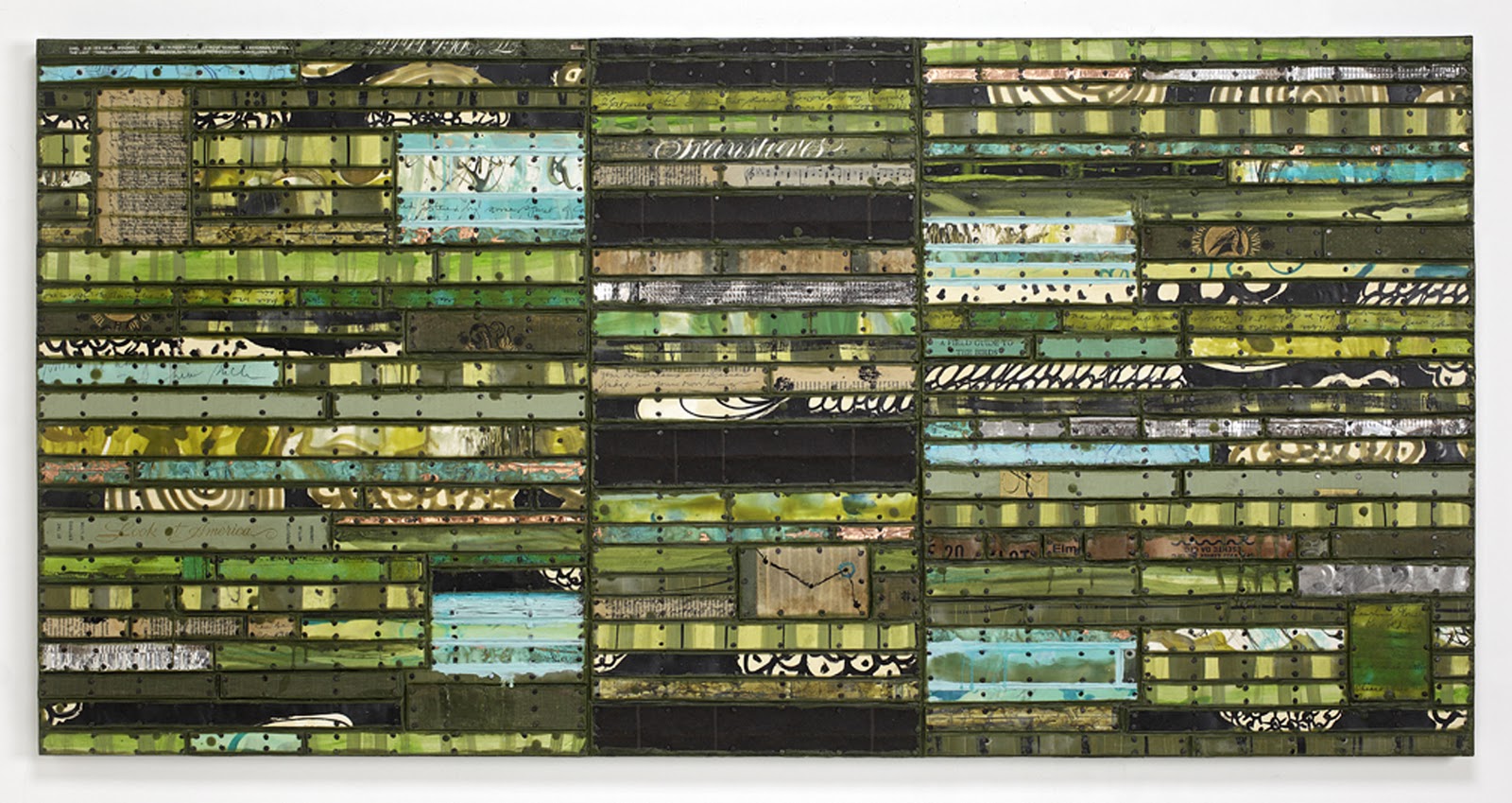
| Look At America, 2011, 30" x 60", painted paper and cardboard, book parts, patinated metal, record album parts, tarpaper, tacks, encaustic on panel. (click to enlarge) |
The work above is constructed/painted on one panel, but I divided it up vertically and put in those black horizontal bands to give it more structure.
 |
| This American Time, 2011, 30" x 60", painted paper and cardboard, book parts, patinated metal, record album parts, advertising posters, record album parts, tacks encaustic on panel. (click to enlarge) |
You wouldn't believe how much looking, reconstruction and time it took me in working on these two pieces to figure this out.
Plan Ahead
So now with the next larger size, I am beginning with a strong structural plan for each of them. The challenge is to add variety and irregularities while maintaining the structure. (As you see with The Black One above, if the structure becomes too regular, it can get dull. However, in defense of this piece, I enjoy the simplicity as a change of pace, and in person, many more irregularities present themselves.)
Progress
When I remind myself that I only began making this work at the end of 2010 and of how many pieces I've made this year alone, I find it surprising. It's been very absorbing - I would even say entertaining. Keeping myself interested and entertained in the studio has become my mission in life, so I guess things are going well. And this year, not even counting the grant, for the first year in many years I have made enough from art to pretty much cover my art expenses. I'd call that a successful year for me. I hope it went well for you!