Showing posts with label artist. Show all posts

Saturday, February 7, 2009

Out of Action


There is a horrible virus going around here in western Mass. that put me out of action for three days. I think I am OK now although still a bit weak. Suffering from something like that really makes you appreciate good health and how we take it for granted.
I hope to post again later today or tonight when my energy level gets a little stronger. Meanwhile, wax on!

Sunday, February 1, 2009

Shameless Self Promotion

Saturday was the opening of Physical Geography, and Lynette and I had a great time welcoming friends, relatives and interested people who had seen the article about our show in the Boston Globe. People seem to be fascinated by encaustic and have so much misinformation about it. Exhibiting encaustic works really feels like an educational project - informing people that it is NOT toxic, NOT batik, NOT about to melt off your wall, NOT that difficult to use, NOT made from crayons, etc., etc.

A Soapbox Digression: The other thing is that it's frequently necessary to lead people away from the craft or technical aspect of encaustic toward the fine art direction. As pointed out by guru Joanne Mattera, I am not an "encaustic artist" but an artist who paints with encaustic - a big difference in focus. Encaustic is the medium chosen to make a painting, and learning the technical aspects of the medium just makes me able to achieve my visual ideas. This concept sometimes gets lost in the discussion of the work, and I have to keep steering in the fine art direction - even steering myself. Why is this important? Because the visual ideas and expressions transcend the medium. The medium is not the message, it is the vehicle. Otherwise we become ghettoized or limited by the medium as in "woman artist."

Back to the opening...When we arrived for the opening, we were very pleased to see the wonderful job that Jero Nessen, Director of the ArtSpace gallery (and developer of the whole ArtSpace building) had done in arranging and adjusting the track lights. Many of the 80 artists in the building dropped by the opening and introduced themselves. Talking about art with other artists is always enjoyable, and it was particularly fun to talk encaustic with New England Wax members who came to the opening. Thanks to everyone for being so enthusiastic about the work! (NOTE TO BOSTON-AREA ARTISTS: ArtSpace has an annual call for proposals for solo and group shows.)


Center of back wall (this wall is 40 feet long) showing my work to left and Lynette's to right.


Looking right - these are Lynette's works. From left: "Harmonium" 10"x22" (an outstanding piece - too bad I cut it off), "Matter of Two" 29"x27", "When It Touches" 16"x48" and "Ruminant" 36"x36".


And continuing around to the right. The two works on the right of this picture are mine - picture taken last week before the lights were arranged. They are "Clark" 24"x66" and "The Maze" 16"x32".


This is starting again on the back wall but moving left this time - four pieces of my quiet, contemplative work - "Happy Family" 24"x24", "Wrigley's Best" 24"x24", "Clark" 24"x66" and "Foreign Influence" 24"x24".


Continuing to the left - Lynette's work: "Reveal" 30"x20" (on the card), "Slight Blueness", "Small Paladin, "Woven", "Dark Paladin" - the 4 small ones, "Paladin I" and "Paladin II" both 16"x16" and turning the corner with "Salt-Rose."


A close-up of Lynette's beautiful "Salt-Rose," 2008, 36"x36" - such a fantastic, weathered-looking surface to this piece but hard to see in the photo.


This is taken from the other end of the left wall and shows my blue diptychs on the left - each panel 16"x16". (Love those black heating/cooling panels!)


Here we are way on the other side of the gallery showing the left side of the entry. These three are my pieces - "The Portal" 16"x32", "Abound" (on the card) 36"x24" and "Red Pearl" 24"x24".


The entry wall on the right - kinda dark - from left: my piece "Falling Water" 16"x32", then Lynette's "Only a Few" 20"x16" and "Dot Burst" 20"x16". and finally my "Forever Blowing Bubbles" and "Tongue Tied" both 12"x24".


These are the same pieces from the other direction - "Falling Water" on left.


And if that wasn't enough, we also had a 16-foot long display case that we filled with encaustic "stuff" - wax balls, an electric grille with pots and brushes, encaustic paint, etc. - I like the reflection of the paintings on the glass.

So, a good time was had by all. Tune in in a couple of weeks for the encaustic demo we're doing.

Thursday, January 29, 2009

Inspiration for Painting - Philip Guston

Yesterday I was thinking about writing a piece on Philip Guston. It was a gloomy, stormy day and I felt kind of melancholy and annoyed, really too cranky to write. In the afternoon, as I went to the door to let the dogs out, I saw a red-tailed hawk in the yard standing over a kill and eating warily. When I opened the door, the hawk flew off with the corpse in one talon. I went over to look at the spot where he had been eating. In the center of the area, surrounded by a ring of feathers (a mourning dove I think), were pieces of viscera - intestines, a foot, pieces of flesh. They were the same dingy pinkish-red color that Guston used a lot.

It's funny the way artists develop a personal pallette - it's just those certain colors that have more meaning than others. Mine has orange, blue, green, white and - the favorite - black. Guston developed his pallette early in his painting career and it never changed even though his painting style went through contortions: white, black and what looks like cadmium red medium plus a weird green and a blue. That pallette identifies Guston nearly as much as the forms he painted over and over in the latter part of his career.

A friend asked why I liked Guston and I told her that the paint handling was what attracted me so much - I liked the luscious surface and the way you could see that he changed his mind in a painting and painted over an area so that it looked like an obvious change, not like it had always been the way it ended up. I admire that because that obvious over-painting gives me a little inkling into the process of construction and lets me see the painter's struggle.

I have a quotation from Guston pinned up on my wall in the studio: "Frustration is one of the great things in art; satisfaction is nothing." I'm not sure I agree that satisfaction is nothing, but lord knows there's plenty of frustration in making art. Is it the overcoming of frustration or the frustration itself that keeps us making?

I think I have three or four books on Guston that I used to spend a lot of time studying. The main one is the hardcover Philip Guston Retrospective, organized by Michael Auping. Another very intimate look at Guston is Night Studio: A Memoir of Philip Guston by his daughter Musa Mayer, which is also about her own life as well as his. The Retrospective has lots of reproductions of works from throughout Guston's career. (There is also a paperback version, but I'm not sure if it's as extensive.)

Looking closely at the works in the Retrospective one afternoon, I began crying because I empathized so strongly with the sadness and despair Guston expressed in those late paintings that are referred to so often as "cartoons." The depth of feeling he painted is intense and the loneliness of his battle against depression, alcoholism, injustice and futility hit me. What a weight he took on! The forms he painted repetitively such as shoes and boots, spindly legs, the huge head with one eye, the bottle, the hooded figures, the bare lightbulb, the pointing finger, the cigarettes, the books, the clock - all became so weighted with meaning, both universal and autobiographical.

Guston, born Phillip (with two l's) Goldstein in Montreal in 1913, had two very traumatic events in his childhood and youth. Most shockingly, at about age 10 he found his father's body hanged in suicide. (His father had been a blacksmith in the old country of Russia and was forced to make a living as a junkman when the family moved to California.) Secondly, when Guston was about 17, his older brother Nat had his legs crushed when his own car rolled down a slope, pinning him. Within a short time he died of gangrene in the hospital.

As a boy and young teen, Guston began drawing and hid himself away in a large closet with a bare lightbulb where he practiced cartoons. He dropped out of high school and had a very limited art education, but he became a talented muralist, who worked for the WPA during the depression and later taught at the University of Iowa. Beginning in the 1950s, Guston began painting abstractly and became a member of the New York Abstract Expressionists.


"To BWT", 1952, 48" x 51", oil on canvas

In the 1950s and '60s Guston made beautiful, abstract paintings that were very successful and extolled by Clement Greenberg and the AbExers.


"Zone", 1954, 46" x 46", oil on canvas

Guston's work began changing as he explored abstraction. Dark shapes started appearing on the canvas but he painted out recognizable images because an image "excludes too much." The paintings he made in the 1960s were called the "dark paintings" and were not well received by critics because they seemed to exist outside the accepted definition of abstraction.


"Close-Up III", 1961, 70" x 72", oil on canvas

By the late 1960s when the Vietnam War was in full swing, Guston was mobilized by the atmosphere of protestors, riots and the election of Nixon in 1968. What he referred to as "the final mask" came down and he began painting recognizable forms - especially hooded figures that looked like Ku Klux Klansmen. (I should say that Guston didn't regard the KKK in an admiring way but said that he was fascinated by evil and wanted to show the KKK carrying on their normal activities - more as ironic models of political actors. These hooded figures actually had been an early theme in his painting in the 1940s.) Rebelling against the prevalent belief of the absolute purity of non-objective form, Guston said, "I got sick and tired of all that purity … I wanted to tell stories!"

In his 1970 show at the Marlborough Gallery in New York, Guston revealed the full extent of his defiance of orthodox Abstract Expressionism when he showed paintings such as "Bad Habits." He was excoriated for leaving the fold of abstraction in much the same way that Bob Dylan was criticized ad nauseum for going electric in 1965 at the Newport Folk Festival.


"Bad Habits", 1970, 73"x78", oil on canvas.

Guston continued painting in his own style for the rest of his life, developing the portfolio of forms that meant so much to him.*


"Painting, Smoking, Eating," 1973, 77 1/2" x 103 1/2", oil on canvas

This work is so much about painting to me. I read it as the painter obsessively seeing his work (all those shoes) in his mind even though the actual painting is not in front of him.


"Head and Bottle," 1975, 65 1/2" x 68 1/2"

Can any image express alcoholic dependency more vividly? (This painting sold in May 2007 for $6.5 million. Drink up!)


"Talking," 1979, 78" x 68", oil on canvas

*Guston was pretty well known in Boston since he taught at Boston University for five years in the '70s and developed a following among his students. His painting "Talking" seems to me that he is gesturing and talking about painting - never out of his thoughts.


Guston died at age 67 in 1980, just three weeks after the opening of the retrospective organized by the San Francisco Museum of Modern Art.

Wednesday, January 28, 2009

Desolation Row

There's something so dispiriting about the studio after all the work that I made for a show is taken out. It looks like Filene's Basement after a big sale - just a few remnants laying around and trash all over the floor. Quite sad.


The only thing I can do to relieve my internal gloom (besides staying away from the studio) is to pick up that broom and start cleaning. Focusing on sweeping the floor lets me avoid that blank wall and lonely feeling.


Then, once I've swept up, bagged the trash and put things away, I find the best thing to do is to switch mediums.

I'm going to be working on paper with acrylic for a while and not fire up the encaustic griddle. The paper (actually ricepaper) is work I usually sell through art consultants to corporate clients. Who knows if anything is selling these days, but if I don't give them any work to sell, I'm guaranteed not to sell anything.

I just received some pieces back from California that hadn't sold and I'm going to be reworking them and sending them out again on consignment. Here are a few of the pieces. I'll show you the "after" shots - if any work gets finished.


This piece is 32x30 inches and is collaged from ricepaper painted with thin washes of acrylic. I called it Yellow Box.


Here's another one - 24x24 inches, called Pongo. Some of the paint is interference so it looks a little funny.


And finally, here's one that's 18x80 inches called Two By Two. This is kind of an exceptional size but a few of them did sell. I didn't have much luck with work that used purple. I guess purple (violet) just doesn't have that corporate cachet.

So what I usually do with this work is start cutting it up and piecing it together with newly-painted patterns, colors and swatches, and/or I overpaint what's there with other colors and then paint patterns on top of that. I do love patterns and especially juxtaposed patterns.

Maybe that will cheer me up.

Wednesday, January 14, 2009

Seeing Your Own Paintings

I love reading what artists have to say about making their work - especially what they say to themselves in their notebooks, sketchbooks, diaries, etc. In The Art of Richard Diebenkorn, John Elderfield includes in his essay (pp 112-113) a list that Phyllis Diebenkorn found in her husband's papers after his death. The undated list was written some time between 1966 and 1976 and headed, "Notes to myself on beginning a painting." This is what it said:

1) Attempt what is not certain. Certainty may or may not come later. It may be a valuable delusion.

2) The pretty, initial position which falls short of completeness is not to be valued - except as a stimulus for further moves.

3) Do search. But in order to find other than what is searched for.

4) Use and respond to the initial fresh qualities but consider them absolutely expendable.

5) Don't "discover" a subject - of any kind.

6) Somehow don't be bored - but if you must, use it in action. Use its destructive potential.

7) Mistakes can't be erased but they can move you from your present position.

8) Keep thinking about Polyanna.

9) Tolerate chaos.

10) Be careful only in a perverse way.

Elderfield, who knew Diebenkorn for a period of years and visited him in his studio many times, also says that "his argument with himself was continuous." His greatest battle was to attain a "reconciliation" between the initial idea for a painting and finishing it while not relinquishing the inspiration. Elderfield describes the process in a very turgid way, but I think what he means is that RD (as we all do) wanted to retain the excitement and freshness that an idea for a painting arouses and not kill it as he went along. RD said, "I can never accomplish what I want, only what I would have wanted had I thought of it beforehand."

Now, here's the part that reminds me of my favorite teacher at MassArt - Rob Moore* - Elderfield says that RD would "contrive things so that he would see a painting when he was 'completely off guard', forgetful of his participation in its ongoing history in the hope of the surprise that would tell him that he had re-established contact with his spontaneity." What Rob Moore said, and what I also say in my artist's statement is that seeing what is there (in a painting) instead of what you think is there is the hardest part of painting.

What connects these two observations about painting is the difficulty that the artist has in seeing his/her work as it exists and not as a record of its history or as the sum of many parts. Some artists keep mirrors in their studios and look at their work through them. I remember George Nick at MassArt saying that he sometimes put a completed painting behind his TV so that while watching TV, his eye would sometimes stray to the painting and he would be able to get a look at what was really there. I tried this in my early days of painting and it did help. Now that we have digital images of our work and can see it on a monitor, we get another perspective, but jpegs don't have the physicality of the real thing and the screen illumination makes it a different experience.

I guess the only thing that works for me is hanging up a painting in the studio after I think it's finished and then living with it for a while. I have to move on to something else and get to the point that I'm not actively looking at the painting and then maybe I can really see it. Sometimes this leads to futzing with it and other times I let it stay as it is. It's all a question of time - but we've all got plenty of that.


*Rob Moore died in 1992, before the online age so there's nothing to link him to. I have a wonderful review by Christine Temin in the Boston Globe of the retrospective of Rob Moore's work that MassArt mounted in 1993. I'll write up some excerpts from it along with some of my own observations.

Saturday, January 10, 2009

Selected Painting(s) of the Day - A Duo

I have two features running in the blog now - Selected Painting of the Day and Inspirations (artists). Rather than do each feature consecutively, I'm going to mix it up a little.

So today I have selected two paintings that I made just recently. These are the two that inspired the threesome I posted last week in the trifecta and a shot of them standing on the floor has already appeared. They are the two largest pieces I have painted to date in encaustic and I enjoyed working at this scale. I named them Lewis and Clark because they were exploring new territory. (I know - kinda dumb. When I told a friend their names, she said that the third piece in the series should be called Sacagawea. What a smart-ass! But coming up with names can be the worst part of making paintings and I don't like numbering - unlike Richard Diebenkorn.)

This is Lewis - the first one. It's a triptych, 66" x 24" x 1.5" on panels. The two end panels with the stripes are not joined but hung close to the central panel. (Please pardon my photographic inexpertise which scrunches the bottom left.) There are various things embedded in the wax such as lace, pieces of plants, felt circles, newspaper, jersey circles, etc. Some areas of the wax are carved or scraped and some worked into with oilstick. There are rough and smooth surfaces.


And this is Clark. It's a diptych, the same overall size as Lewis although this image makes it look bigger. The panel from the left through the orange rectangle is one piece (52"x24") and the second panel (24"x24") goes from the skinny two-toned blue stripe through the right side.

I think these pieces are something new for me. They have the somewhat softened geometric structure that I like, but their structure is not the first thing that you notice about them. The color is varied, a bit different, and the patterning plays with two and three dimensions. I consider them a successful exploration that referenced past work but broke new ground for me. Onward!

Tuesday, January 6, 2009

Selected Painting(s) of the Day - A Trifecta

Today I'm featuring a trifecta of new encaustic paintings. Now, you might call it a triple selection instead of a trifecta, but I'm going by the definition of trifecta that I found in Wikipedia (and we all know that they are right on top of things), which is: "The situation of having three major accomplishments or achievements in a sport, profession, or pastime." In racing terms, a trifecta is making a three-part bet in which you must pick the the 1st, 2nd and 3rd place winners in one race or hit the first-place winners in three consecutive races. (I remember that from the really olden days when I used to go to the dogtrack at Wonderland - before enlightenment struck .)

Anyway, these three paintings were made to go with two larger ones. They are geometrically organized, but in a softer, more organic way. They have fiber pieces embedded in them that form the structure and give some dimension. The palette is fairly limited and consists basically of my favorites - orange and blue - plus some greens and, of course, the Big Favorite, black. They are all 24" x 24" x 1.5" on wooden panels.

Wrigley's Best, 2009, Encaustic, oilstick and fiber

Happy Family, 2009, Encaustic, oilstick, fiber and beads
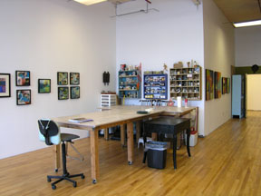
Foreign Influence, 2009, Encaustic, oilstick and fiber

This trifecta has a lot going on with patterns, directions, colors, etc., but I was trying for a balance of elements that felt considered rather than arbitrary. After making these pieces, I really feel the need to paint something very simple, but fat chance of that happening, knowing my prediliction for complication.