Ever wish you had a secretary? Having been one in years gone by, I sure wish I did so that I could lean back in my chair, put my feet on the desk and dictate this post to someone with a steno pad on her knee. Ah, those were the days! Must be the Mad Men influence.
Anyway, where was I? Oh, yes. In Chelsea running over to Blank Space on West 25th Street to see Debra Ramsay's
show,
Desire Lines.
The title of Debra's show refers to a landscape architecture term for the paths that people take through a landscape regardless of which path they were
meant to take. This heedless traffic results in visible pathways, usually the quickest routes between desired points, that circumvent intended control or restrictions. (Note that many of the images will expand if you click on them.)
 |
| Debra Ramsay, Week One, 2012, wax on panel, 6" square |
In the same way, Debra's recent paintings at Blank Space are based on a predetermined system of mark making that retains control to a certain point but then allows accident and chance to take over. The works above and below are from the "Pouring Over Time" series. Here is Debra's program for these paintings as quoted from the show's press release:
"For the 'Pouring Over Time' series, Ramsay developed a methodology based on a fixed linear constant: time. Each panel is divided into six columns, representing the two-digit numerals of the month, day, and year of the painting's title. Those numbers determine the number of times a line of poured wax will start in that column, thereby encoding the date in the painting. The starting point of each poured line retains the hard edge determined by the original division. Ramsay allows the effect of gravity on the molten wax to direct the quality of the line, and this new line creates its own representation of the time of its making."
 |
| Debra Ramsay, Cruel Desire, 2012, wax on panel, 12" square |
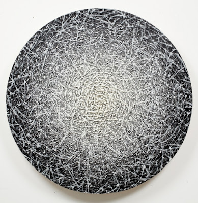
The beautiful, saturated color in these works really stood out as contrasted with the graphite and white palette of Debra's wax and eggshell works also in the show.
 |
| Debra Ramsay, Gratitude for Agnes Martin, 2012, wax on panel, 12" square |
On the other hand, there were also lovely pale greys and taupes such as the soft palette of this work just above. This coloration was taken from Agnes Martin's painting, Gratitude, and the painting encodes the date of Martin's birth in pink, the date of her death in grey.
Here is the
link to Debra's press release on the Blank Space site that describes the show in detail.
Desire Lines is up until May 19th so there is still plenty of time to see it. Go, go!
Reed Danziger at McKenzie Fine Art
Right across the hall from Blank Space,
McKenzie Fine Art had a great show of paintings by Reed Danziger. This work was as complex and layered as Debra's work was pared back and reduced to essentials. All three of us (if you recall it was Greg Wright, Binnie Birstein and me) just loved the work even though our own work ranges all over the map.
 |
| Reed Danziger, Angles of a Particle, Phase E, 2012, 20" x 20", mixed media on paper mounted on wood |
These works were painted with a delicacy and fineness of detail that compounds their expressive movement and dense accumulations of marks. There is such a lot to absorb in the masses of marks centered on the scumbled and stained backdrops, but they feel perfectly balanced and uncrowded. Here's what the artist said about them:
"In this latest group of paintings, I've continued to explore the shift towards greater abstraction through color and movement. The new work is more celestial, and the forms less clearly describe organic structures; rather they feel like the sum of entire universes. The particles that define these galaxies merge and shift, expanding and contracting, and each disruption reveals an ever increasing unpredictability. As the paintings progress, what is complex and what is simple becomes relative and continues to change with time. The tension I often feel when making the paintings is reflected in the cosmic chaos captured in each piece. As I continue to explore the folding and flexing of these abstract worlds, I allow myself to be more and more consumed by the random bursts of energy defined by the unique gravity of these paintings."
 |
Reed Danziger, A Differential Coherence, 2012, 36" x 36," mixed media on paper mounted on wood
|
 |
| Reed Danziger, A Second Order Reaction, 2012, 36" x 36," mixed media on paper mounted on wood |
This show is only up until April 28th so you have one more week to get there. Worth the trip!
Catherine Lee, Galerie Lelong
As we strolled down West 26th Street, we saw some interesting paintings when we looked into
Galerie Lelong. These glowing, gridded works are painted with repetitive brushstrokes that are meant to mark the passage of time.
 |
| Catherine Lee, Chocolate Cadmium (Quanta #21), 2012, 54" x 54", oil on canvas |
For example, in Chocolate Cadmium, the underpainting is a chocolate brown and the grid on the surface is cadmium red. However, you can see the color variation of each square in the grid that gives the work its feeling of being lit from behind. Each square is painted with a separate brushstroke, meaning that smaller grids are painted with smaller brushes and so on.
 |
| Catherine Lee, Like the Bright Sky All Fired Upon (Quanta #24), 2012, 30" x 30", oil on canvas |
Here's a description of the work from the gallery's press release:
" The exhibition and series’ title, Quanta, takes its name from the physics term that refers to a discrete quantity of radiant energy. Each individual square on the canvas’s grid releases its own unit of light and color, resulting in an overall dynamism. In Tottenheads (2011), Prussian blue peeks out from under the foreground of supple squares of cadmium red, thrusting the red towards the viewer. Lee sees painting as a ritual act and each square on the canvas as binding a relationship between her and the individual painting. The titles are often drawn from the artist’s own poetry, adding another personal element to the work."
 |
| Catherine Lee, Act III, Scene IV (Quanta #31), 2012, 8" x 8", oil on canvas |
The blue pieces were my favorite because they really were exceptionally glowing. When we asked the price for this 8" x 8" piece, however, we were astounded. I won't even mention how astronomical it was. I guess if you had to ask...
Lush Geometry at DM Contemporary
Finally, after a long slog to East 29th and Park, we arrived at
DM Contemporary, our ultimate destination and true motivation for the New York trip, the opening of
Lush Geometry featuring our guru, mentor and friend, Joanne Mattera.
Lush Geometry is a show of work by five artists:
Steven Baris,
Richard Bottwin,
Carole Freysz Gutierrez,
Joanne Mattera and
Louise P. Sloane. The standouts for me (and my pals) were Joanne and Steven. I have given the website links for each of the artists so you can see what their work is like, and I'll just include here three of Joanne's five
Diamond Life paintings that were in the show. I'm sure that Joanne will be writing more about the show as a whole on her
blog.
 |
| Joanne Mattera, Diamond Life 18, 2012, 22.5" x 22.5", encaustic on panel |
This subtly-colored beauty includes unpigmented wax with a pale metallic so that the diamonds seem to appear and disappear depending how light strikes the piece. The bisecting horizontal lines seem to ground the verticality of the diamond-shaped panel and add a counterpoint to the grid of diamond shapes. Brushstrokes on the surface of the wax add physicality to the work and show the artist's touch on the sensuous and "lush" surface.
 |
| Joanne Mattera, Diamond Life 20, 2012, 22.5" x 22.5", encaustic on panel |
 |
| Joanne Mattera, Diamond Life 21, 2012, 22.5" x 22.5", encaustic on panel |
Here is Joanne's statement about the work:
"For the past year or so, I have been turning my square panels diagonally so that they become diamonds, a shape that both punches into the space around it and rests in perfect equipoise en pointe. Within that diamond field is a formal arrangement of attenuated diamonds bisected horizontally so that the surface appears almost faceted. In a largely monochromatic palette, light hits the diagonal grain so that structure and pattern are pronounced. For the paintings in Lush Geometry at DM Contemporary (
http://www.dmcontemporary.com/exhibitions/lush-geometry/intro.html) I upped the ante with iridescence and the shimmer of metallic. The color, though mutable, is more luminous."
The End of a Perfect Day
We had a great time at the lively, crowded and very noisy opening at DM Contemporary and enjoyed seeing friends and meeting new people. We capped the evening with a great and inexpensive dinner at a Thai restaurant right down the street and had a fun ride back to Connecticut chatting, dishing and laughing all the way home.


.jpg)


