Wednesday, January 25, 2012

Inspired By a Master

If you've been reading this blog for a while, you are probably familiar with my Big Three - Leonardo Drew, El Anatsui and Lee Bontecou. Other masters, such as Joan Mitchell, Philip Guston and Richard Diebenkorn,  also inspire me, but the Big Three appeal more to my somewhat dark and grim natural aesthetic. Above all, materiality or physicality is what resonates with me.

So, as I think any artist must, I ask myself from time to time how much I should be influenced by my inspirations. Should I try to copy their work? How much of them should rub off on my own work? Is there a point where my work becomes more about what they want to say than what I do?


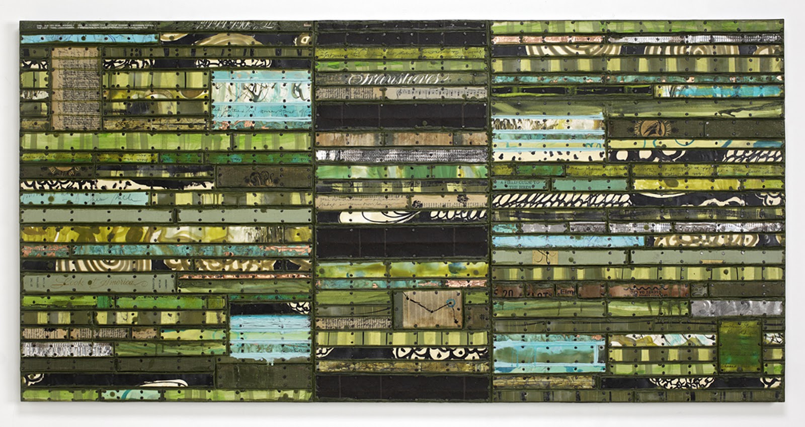
Thinking L.D., 2012, found and invented materials with tacks and encaustic
on two panels, 48"H x 60"W (click to enlarge)

Here is the first piece I've made that somewhat deliberately (in my mind at least) refers to work by one of my Big Three - Leonardo Drew. If I didn't tell you that, would you have guessed? (Of course that's provided you are familiar with his work.) What I was thinking of was his work with boxes put together into a grid, such as his No. 43 of 1994, image below:


Photo of Leonardo Drew's No. 43 taken from "Existed"
(For more about Leonardo Drew, see this blog link to his show
at the DeCordova Museum.)

Now, you can see that my piece looks nothing like his, really, but thinking about his piece is what got me going. His piece has 3-dimensional boxes with rags, found objects and all kinds of stuff in them. My "boxes" are just strips of painted cardboard that frame strips tacked inside them. And my piece is ever so neat, compared to his.


A detail from Thinking L.D.


The Creative Process - Try and Try Again
Just to let you in on how the creative process went for me, I first started with "boxes" the same size throughout the panels, made just with strips of natural cardboard painted with clear encaustic. I used them to frame strips of other materials that I tacked down as usual. I ended up with something that looked like a cardboard bookcase. So I scrubbed that.


Another detail from Thinking L.D.


The second version enlarged some of the "boxes" but continued them throughout the length of the panels. I thought it still looked like too much cardboard. Then I removed rows of the "boxes" at top and bottom of the panels and put in painted strips that extend the width of each panel. I liked that because they broke up the "box" look, and it turned out that these strips were what really interested me. (After coloring in the cardboard "boxes" with oilstick, I was happier with the overall piece.)

An Unexpected Bonus - A New Direction?


Half 'n' Half, 2012, found and invented materials with encaustic and tacks, 32"H x 40.5"W


In fact I liked those painted strips so much that I decided I should make another piece using the leftovers (plus a few more). I put them on a panel and then added that to a panel I had already made in Running Stitch mode. After tweaking the R.S. panel a bit to make the two halves come together more, I was happy. (The bottom panel is one I had made myself so its measurements are a bit off from the standard. However, it turns out that I like the little bit of difference in width between the top half and the bottom half. It gives it sort of an architectural look)


Detail of painted strips from Half 'n' Half

A Moral
Don't we expect a moral from any story - or at least a good ending? Well, the moral is that whatever pings your aesthetic brain cells and gets a piece started is a good thing, but being able to see what you've got and where you're going with it is a learned response, I think. And, who knows, a move made out of desperation may be that unexpected path that takes you to artistic nirvana - or not. You'll just have to try it and see.

Saturday, January 21, 2012

Blues for Etta

The whole world seems to be mourning the death today of the great Etta James. She passed away much too young and after a hard life filled with both pain and ultimate success. I own probably 12 or 15 of her CDs and play them in the studio pretty much every day. I will miss knowing that she's out there still singing.

New Work
Back at the end of December when I was planning to make two pieces for my upcoming solo show, I had an idea based on a quilt from the 1930s that I had seen in a book  You know how two ideas floating around in your mind can sometimes coincide? Well, in this case, the quilt top idea came together with the news I heard about Etta James being very ill and expected to die soon. The result was Blues for Etta, mixed media with encaustic (including record albums, sheet music, tarpaper, copper, aluminum, and tacks) on two panels, 48"H x 60"W.

Blues for Etta, 2012, details in text above (click to enlarge)

I don't know how this looks on your monitor, but on mine it's disappointing because this image doesn't convey the vibrancy of the blues and resonance of the browns. And the reflectiveness of the copper really makes the whole piece shimmer.


Here's a detail showing one of several images from CDs that I incorporated .

Recently I read Etta's bio, Rage to Survive by Etta James with David Ritz and I recommend it - not too well written, but the tale of a great spirit who emerged into the world despite overwhelming odds. Here's a link I found on The Guardian to an obituary of Etta that reprises much of her bio. It tells much of what shaped her hard life and determined approach to life that was revealed so strongly in her singing. She was a tough cookie and that came across vividly. (Read a column by my e-friend Wendy Rodrigue in Gambit, the New Orleans paper, about Etta that includes an image of my Blues for Etta!)

Recommendations of Etta's CDs
I am not a fan of Etta's earlier recordings where she shouts instead of sings, but when she came into her own later in life, she became one of the very best blues singers. Here's a good article about her from The New Yorker with some Youtube links. Unfortunately, the links are mostly from her earlier work. If you want a really good, mellow CD that I think is one of her best, try The Right Time, an excellent recording with Steve Winwood on guitar. For an album that's more jazz than blues with lovely piano accompaniment, try Time After Time, some of her best. And Matriarch of the Blues is also a good one.

Etta on Youtube
There are many videos of Etta on Youtube, some better than others, but here's a good one from Matriarch of the Blues, Bob Dylan's Gotta Serve Somebody.

Wednesday, December 28, 2011

Adventures in Making Art

Last Friday I received notice that I had been awarded a good-size grant by the Artist's Resource Trust, a fund of the Berkshire Taconic Community Foundation. I applied seven (count 'em, 7) times for this grant without getting anywhere until this year. The grant is not contingent on my completing a project, but I did describe a project on the application that I hope to complete. It involves building a wall of works on 24 panels in an 8' x 12' configuration. The works would be in my Running Stitch series and I would like to show the wall in a small museum.

The Bing at night, photo by Chris Marion Photography, from The Bing's website


Money Changes Everything
Remember that song by Cyndi Lauper? Well, here's how the grant influenced me and changed my plans. I am having a solo show beginning February 3rd at the Bing Arts Center in Springfield. (I posted about this in more detail on my Art of Bricolage blog, link here.)  Although I have known about this show for a while, I had planned to show oil paintings because the space is quite large and I didn't think I had enough bricolage on panel works to fill the space. But when I learned that I got the grant and might be able to complete the project I envisioned, I was jostled out of my complacency. My thinking was that if I planned to contact some museums and other exhibition spaces about showing my uncompleted project, I had better have some big work to show them.


The Black One, 2011, tarpaper, book parts, patinated metal, oilstick,
tacks, encaustic on panel, 36"x36" (click to enlarge)

I've been gradually increasing the size of works that I'm making from 36" x 36", as above, to two just-completed Running Stitch pieces on 30" x 60" single panels. Waiting in the wings were four panels ready to make two diptychs, each 48" x 60", but I've been stalling on them. The grant has now motivated me to get cracking and get building. I have changed the title of the Bing show to GEOMETRIC BRICOLAGE: Found Materials Transformed and I've planned out the two 48" x 60" pieces so that I can complete them in time to show.


Discoveries of Scale
It's a good thing I've never had to work in a widget factory because I really don't like and can't do multiples of the same thing. Every time I make a piece, I do something a little different. As I've proceeded piece by piece with the Running Stitch and RS variants, the overall size has increased as well as the size of the elements. I have discovered that as the works get bigger, they need more structural elements to carry visually from the greater viewing distance their size requires. This is probably like reinventing the wheel but it's been a slowly evolving Aha for me to realize this.


Look At America, 2011, 30" x 60", painted paper and cardboard, book parts,
patinated metal, record album parts, tarpaper, tacks, encaustic on panel.
(click to enlarge)

The work above is constructed/painted on one panel, but I divided it up vertically and put in those black horizontal bands to give it more structure.


This American Time, 2011, 30" x 60", painted paper and cardboard, book parts,
patinated metal, record album parts, advertising posters, record album parts, tacks
encaustic on panel. (click to enlarge)

In this work, I used the solid red book cover pieces to add structure and unify the various colors, marks and printing.

You wouldn't believe how much looking, reconstruction and time it took me in working on these two pieces to figure this out.

Plan Ahead
So now with the next larger size, I am beginning with a strong structural plan for each of them. The challenge is to add variety and irregularities while maintaining the structure. (As you see with The Black One above, if the structure becomes too regular, it can get dull. However, in defense of this piece, I enjoy the simplicity as a change of pace, and in person, many more irregularities present themselves.)

Progress
When I remind myself that I only began making this work at the end of 2010 and of how many pieces I've made this year alone, I find it surprising. It's been very absorbing - I would even say entertaining. Keeping myself interested and entertained in the studio has become my mission in life, so I guess things are going well. And this year, not even counting the grant, for the first year in many years I have made enough from art to pretty much cover my art expenses. I'd call that a successful year for me. I hope it went well for you!

Saturday, December 17, 2011

Out, Damned Spot! Out, I say!

This is the time of year when it's pretty hard to stay on course in the studio. There are just too many things happening in the outside world - parties, shopping, grant applications, studio visits and other distractions. I am feeling all that interference with the normal course of non-events in my private world, and to top it off, I am moving into a different kind of work.


Having just completed two large works in the Running Stitch series, my mind's eye is sort of fixated on that mode. I've been making notes and sketches for future projects and want to get started on them for the solo show I have coming up in February. But, I'm also interested in submitting works to Supria Karmakar's call for submissions for The Wax Book, a juried exhibition at Castle Hill Center for the Arts in Truro to be shown during the Sixth International Encaustic Conference in June.

Back in the 1990s I made a lot of artist's books - and pretty much drove myself crazy, by the way. My personality is not one that cleaves to the neat and tidy, plan-ahead world in which I made my artist's books. I'm a little more rough and ready and felt I was boxing myself in. I'm a lot more comfortable with either a paintbrush or a hammer in hand, so I gave up artist's books and went back to the messy, hands-on world of painting. (Here are some images of books I made in the 1990s - complicated, all handwritten and I made them in small editions of four or six books the same. Ugh!) (click images to see larger)


Visiting Nature - open


Beach Music - open


On The Road - open midway

The fact is that I could just have changed the type of artist's book I made and not gone for the intricate dimensional pieces I was doing, but when I'm done with something, I'm flat-out done - that is, until I get back to it at a later date.

So, this past week has been a bust in the studio. Between visitors, working, shopping, driving to Boston and partying, I barely got in there. Today I finally came face to face with myself and started trying to come up with some ideas. I couldn't make my usual mess because I'm having visitors on Monday, so that meant I couldn't do what I usually do - pull everything out and try some things. Coming up with ideas under pressure is probably my least favorite part of being an artist. I just get squirmy and do anything to avoid that blank spot between my ears - email, Facebook, magazines, newspapers, trips to the trashroom, anything, anything to get me out of that nasty blank spot. Today I even tried sitting quietly in my chair and visualizing something I would like to see but that didn't work either.

Finally my eye lit on three objects that I've had kicking around the studio for a couple of months and have planned to use one of these days. I brought them to my table and started fooling around with them. Wonder of wonders, I got ideas (or "idears" as I would say)! I believe I have a solution for my book making problem! (In fact, three solutions.) As soon as I had a few preliminary plans in mind, I got the hell out of there before I acted too soon and screwed things up.

No, I'm not going to tell. You'll just have to wait and see - along with me.

Wednesday, December 7, 2011

New Work All About America

Never have I felt as American as when I have traveled outside America, and I don't think that is a unique experience. Our native country is such a part of our psyches that it just becomes reflexive, so natural that our Americanisms are unrecognized for what they are. However, I rarely use the word "America" to refer to this country, preferring "U.S." instead. "America" seems a little outdated or a word used only by politicians or advertisers. So that makes it a little surprising (to me) that my two newest works both refer in their titles to America.


Look At America


Look At America, 2011, 30" x 60", painted paper and cardboard, book parts,
patinated metal, record album pieces,  tacks, encaustic on birch panel (click to enlarge)

The title Look At America is the name of a book used in the piece and getting my titles from books used like this is a becoming a common practice for me. I posted several details from this piece last month and here's the link, but the photo above was taken by a pro who has it correctly lit and containing many more pixels than my earlier amateur shot.

Here's what I said about the piece in my post last month:

My intention with this work was to reference landscape but not really depict it. There are pieces of maps in there and the combination of green, brown and blue could be earth, trees and sky. But I didn't want it to be a literal representation of place. After all, the Running Stitch series is about memory, so perhaps this is about memory of landscape rather than landscape itself. The black sections could be roads or they could be gaps in memory (or they could just be formal elements in the painting).

I think this piece has a very complex organization but that the rhythmic black elements in the center section hold it together. As a loosely metaphorical representation of America, the piece had to represent the complexity of this country--the physical beauty and vast spaces combined with the crowding, crumbling and abusive use of so many resources (and people). On the other hand, it's not a literal representation so making it complex just allows the viewer more opportunity for discovery as well as giving me more to juggle.


This American Time


This American Time, 2011, 30" x 60", painted paper and cardboard, book parts,
patinated metal, record album pieces, tacks, encaustic on birch panel (click to enlarge)


The title for this piece came about by accident in a sense. I have begun to use advertising posters for performances along with other found cards and printed materials. From somewhere, I cut out the words "This American" and partially obscured them by cutting off the bottom of the letters. At the other side of the piece, I had put in the word "Time" in an upright position so that it could be read. When I saw these words together, they made sense as a title to me because there are a number of references to time in this piece--dates, words, texts, pieces of things that relate to specific annual events or time elapsing.

Although the emphasis on time is certainly not specifically American, I'm not alone in recognizing that we Americans are increasingly under pressure of time these days as we try to fit more and more into our lives. The burden of a busted economy and necessity to struggle financially adds to a feeling of frantic movement and spinning our wheels. Technology has eased many things but also made it more difficult to escape its siren call. How frequently do we check our email or Facebook? Can we fit in another call or text message while we are doing something else? Multi-tasking is a way of life and concentrating on the here and now has become a goal toward which we must strive rather than the expected way of dealing with life. I speak for myself in this because I find now that if I am not doing at least a couple of tasks at once, I feel a sort of emptiness along with a beckoning from other things calling for my attention.

In thinking (after the fact) about the meaning of formal elements in this work, I could envision the solid red horizontals and verticals as depicting paths through the maze of printed and painted elements. Dividing the whole into parts is a representation of time as well as space and I think these elements perform both functions. The extreme red so present everywhere is a call to action and attention. Everything is on high alert, not only according to the Bush terrorism scale, but just the way red functions psychologically for us, urging us to "Look Here Now."

But, conversely, if everything is urgent, then nothing is. That sounds like American time to me.


xxx

Monday, December 5, 2011

Coming Soon

The new red piece in the Running Stitch series.


A detail

I just took this to the photographer's tonight along with the new green piece - red and green, get it? I hope to post full views of them both later this week.

Sunday, November 20, 2011

Look at This America, One You Don't Want to See

From Laura Moriarty's Facebook page. 
The Artist's Depiction
The image above is what Joanne Mattera called "Sunday in the Park With the Aftermath of George (Bush)."


Lt. John Pike pepper spraying non-resisting students at UC Davis.
The Real Thing
You have probably already seen this real image of a man in power treating non-resisting students like roaches by spraying them with pepper spray. This strolling Keystone-Kop-looking guy is Lt. John Pike of the UC Davis police force. He has a lot in common with Lt. Anthony (Tony Baloney) Bogogna of the NYPD (see below).


And here's the video the precedes the UC Davis action and shows that afterwards the police, in full, ridiculous, SWAT, riot gear, backed away from those vicious students (armed only with iPads, iPhones and their voices). By the way, a UC Davis spokesperson said later that there were 35 police officers, 50 protesters and 200 bystanders present during this action.

A note on what pepper spray is:

"Pepper spray, which in many countries is defined as a weapon and is often illegal for civilians to possess, can cause tissue damage, respiratory attacks and, in rare cases, death. It is considered far superior during crowd control to more violent forms of self-defense. But, like Tasers, which can also cause severe injury and death, there is increasing concern than it is being used by law enforcement without discretion or proper understanding of its dangers. The UC-Davis video will only amplify those concerns."(from the Washington Post)


These officers are employed by UC Davis and were called in by the Chancellor of UC Davis, Linda P.B. Katehi. This is her statement as reported by Huffington Post:

"We deeply regret that many of the protestors today chose not to work with our campus staff and police to remove the encampment as requested. We are even more saddened by the events that subsequently transpired to facilitate their removal."

The UC Davis Police Chief, Annette Spicuzza" claimed that it wasn't "safe for students to camp on the quad. It's not safe for multiple reasons."

And, in what is probably the most ludicrous claim of all, Spicuzza claimed that it also wasn't safe for her officers on the quad because they were outnumbered by students. The amount of riot gear the police were wearing plus the stun guns, pepper spray, enormous "batons", handcuffs, and all manner of other equipment strapped to their bodies makes this statement totally asinine. But if you watch the video to the end, you will see the police slowly shuffle backwards away from the students who are yelling "Shame on you." Apparently they were just fearful for their lives, those poor over-equipped guardians of the law!

Now calls are being made for the chancellor to resign after displaying her total lack of understanding of what the hell was happening on her campus and not showing horrified dismay over the actions of "her" police force. She has called for a 90-day investigation of the incident when 90 minutes would probably suffice.

As a final comment on her behavior, get a look at this perp walk the chancellor makes in front of seated and totally silent students. She had said that she was afraid of walking to her car because of the students. The only voices you hear in the video are those of reporters asking questions of the chancellor. Otherwise, there are just ominous-sounding footfalls.


This is not an America I want to see. It is a place where those in power think they can treat the rest of us with disrespect and abuse. This is the kind of treatment that people in black and immigrant neighborhoods are subject to much of the time. It's a Bush/Cheney-attitude where force is used to keep down the Little People and show them who's in charge, without regard for moral or legal right.


The sad part of it is that this is just one little, now viral incident. This cruel and abusive behavior goes on all the time with no one noticing or caring. We are subject to our corporate masters more and more and the police are simply their minions, just as much serfs as the rest of us, but able to take out some of their aggressive and hateful actions on those they are supposedly protecting. I find the whole thing sickening and depressing. I remember Kent State, where protesting students were actually shot and killed, and all the student strikes that followed. I hope that we are not entering a period like that again but our corporate masters will not relinquish their power voluntarily.


Here is a great article about the Militarization of Campus Police by Bob Ostertag, a journalist and professor at UC Davis. He makes some wonderful points, right on the money!


And furthermore, as posted by Mira Schor via Joni Spigler:


Even Bambi's pals get the spray!


And another one:


This one is even more meaningful - Lt. John Pike pepper sprays the Constitution
even as it's being written. Oh, yes! He has sprayed on the rights of us all to peacefully
protest and express our constitutional rights to free speech. Thanks to Kiril Devyatov on Facebook.


And still more of these http://peppersprayingcop.tumblr.com/  This guy is the laughingstock of the WORLD!