Look At America
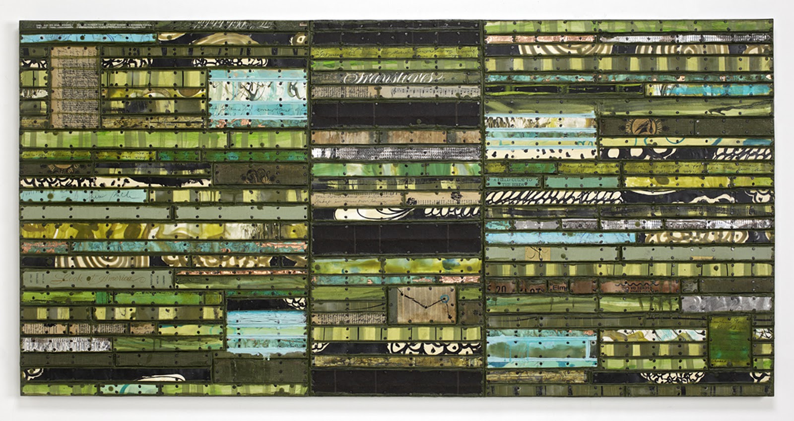 |
| Look At America, 2011, 30" x 60", painted paper and cardboard, book parts, patinated metal, record album pieces, tacks, encaustic on birch panel (click to enlarge) |
The title Look At America is the name of a book used in the piece and getting my titles from books used like this is a becoming a common practice for me. I posted several details from this piece last month and here's the link, but the photo above was taken by a pro who has it correctly lit and containing many more pixels than my earlier amateur shot.
Here's what I said about the piece in my post last month:
My intention with this work was to reference landscape but not really depict it. There are pieces of maps in there and the combination of green, brown and blue could be earth, trees and sky. But I didn't want it to be a literal representation of place. After all, the Running Stitch series is about memory, so perhaps this is about memory of landscape rather than landscape itself. The black sections could be roads or they could be gaps in memory (or they could just be formal elements in the painting).
I think this piece has a very complex organization but that the rhythmic black elements in the center section hold it together. As a loosely metaphorical representation of America, the piece had to represent the complexity of this country--the physical beauty and vast spaces combined with the crowding, crumbling and abusive use of so many resources (and people). On the other hand, it's not a literal representation so making it complex just allows the viewer more opportunity for discovery as well as giving me more to juggle.
This American Time
 |
| This American Time, 2011, 30" x 60", painted paper and cardboard, book parts, patinated metal, record album pieces, tacks, encaustic on birch panel (click to enlarge) |
The title for this piece came about by accident in a sense. I have begun to use advertising posters for performances along with other found cards and printed materials. From somewhere, I cut out the words "This American" and partially obscured them by cutting off the bottom of the letters. At the other side of the piece, I had put in the word "Time" in an upright position so that it could be read. When I saw these words together, they made sense as a title to me because there are a number of references to time in this piece--dates, words, texts, pieces of things that relate to specific annual events or time elapsing.
Although the emphasis on time is certainly not specifically American, I'm not alone in recognizing that we Americans are increasingly under pressure of time these days as we try to fit more and more into our lives. The burden of a busted economy and necessity to struggle financially adds to a feeling of frantic movement and spinning our wheels. Technology has eased many things but also made it more difficult to escape its siren call. How frequently do we check our email or Facebook? Can we fit in another call or text message while we are doing something else? Multi-tasking is a way of life and concentrating on the here and now has become a goal toward which we must strive rather than the expected way of dealing with life. I speak for myself in this because I find now that if I am not doing at least a couple of tasks at once, I feel a sort of emptiness along with a beckoning from other things calling for my attention.
In thinking (after the fact) about the meaning of formal elements in this work, I could envision the solid red horizontals and verticals as depicting paths through the maze of printed and painted elements. Dividing the whole into parts is a representation of time as well as space and I think these elements perform both functions. The extreme red so present everywhere is a call to action and attention. Everything is on high alert, not only according to the Bush terrorism scale, but just the way red functions psychologically for us, urging us to "Look Here Now."
But, conversely, if everything is urgent, then nothing is. That sounds like American time to me.
xxx