Showing posts with label Gregory Wright. Show all posts

Wednesday, May 8, 2013

Gregory Wright - FORCES

Greg Wright, a friend and skilled painter, is currently having a solo show of 18 works in his series, "Forces", at Galatea Fine Art in Boston's South End, running until May 31st.


Detail of Synaptic III

Shifting, Expanding, Creeping, Growing, Intertwining
The works are all painted in a grisaille palette of mostly greys, whites and blacks, but despite the overall somber tonality, the marks and forms in the works appear to be actively moving in a lively exploration of space. Those forms represent "the dissemination and movement of information and the unspoken word" but are also unseen forces present throughout life within our bodies and in our souls. Portraying all of this is a weighty challenge, but Greg paints twisting and intertwining organic forms in many shapes and configurations that he imagines in various scenarios. This is a powerful collection of works that draw the viewer in to visual exploration of the dark recesses within the sinewy compositions.

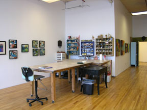
Viewing the Exhibition Moving Around the Gallery  (be sure to click on the images to enlarge them)
(Note: I'm sorry for the color differences here and there caused by those yellowish photos being taken by my iPhone. Others were taken with a more-pixelated camera.)


At right, Synaptic I, II and III, 2011- each 48" x 20,"
At left, The Truth Comes Out, 2012, 36" x 30"
All painted with encaustic, oil, pigment and shellac on birth panels

As we enter the gallery space proper, the three tall Synaptic paintings are on the right and ahead is the slightly more colorful The Truth Comes Out. One of the forces that Greg refers to is synaptic reaction as electrical impulses move through our bodies or across the internet. He is interested in the forces that set off this chain reaction and perpetuate change.


 Synaptic I, II and III, 2011


Synaptic III


The side wall of the gallery showing left to right - The Quest, diptych,
On Many Different Levels I and II (boxes) and The Truth Comes Out


Dimensional Illusion
Seeing these works on the screen,may give the impression that they are actually sculptural, and although they do have some areas where encaustic paint is built up, these are two-dimensional paintings. Hieronymus Bosch is an influence, but where Bosch depicted humanity to comment on social and religious life, Wright's forms are abstractly organic and vaguely familiar but not identifiable. He refers to them as "Baroque-like compositions of beautiful complication."


The Truth Comes Out, 2012, 36" x 30"
encaustic, oil, pigment and shellac on birth panel


I think The Truth Comes Out is my favorite piece in the show. It seems to portray an undersea world of seaweed, billowing bubbles, limitless underwater depths and some kind of strange egg shapes. The mostly grey palette has a few cool greens added that enhance the illusion of or allusion to the sea world. Or could this be an imaginary glimpse into the inner workings of the body, not pink and red as we know it, but cooly grey and white with touches of green?


Closeup of The Truth Comes Out


On Many Different Levels I and II, 2011, each 6" x 6" x 6"
encaustic, oil, pigment and shellac on wood

These boxes are painted on five sides with a continuously expanding portrayal of forms moving through space and interacting with each other. 


The Quest, diptych, 2010, each panel 30" x 24"


Left panel of The Quest

The forms in this diptych almost take on human shapes tumbling through space, but the forms retain their anonymity as they "morph, combine, and reimerge into something other than their original state."


Left, Reaching Out, 2010, 36" x 30"
Right, Lucid Moment I and II, 2011, each panel 40" x 36"
All three painted with encaustic, oil, pigment and shellac on birch panels


Lucid Moment I and II


Lucid Moment I from a closer perspective

In the Lucid Moment paintings the scale and shape of the forms change to become larger, more frontally presented and less rounded. Connections between the forms are emphasized by chains of thin links making them into a continuous unit. These works, Wright says, are "about finding clarity or reaching a climax."


Reaching Out, 2010, 36" x 30", encaustic, oil, pigment, and shellac on birth panel

Reaching Out, detail

This spiderlike or crablike form appears to have burst out of its surroundings as if it is moving forward toward the viewer. The beautifully-textured background seems rock hard while the form itself looks soft but powerfully graceful. Does this depict what Greg refers to as "an awakening in the soul?" 

Moving around the gallery, we come back to a short movable wall that faces a window into the hallway on one side and the gallery on the other.


On the gallery side of the wall, is a diptych called Convergent, painted on
two 18" x 18" panels


While on the window side of the wall, a quadtych of four 10" x 10" panels in
The Story Continues promises more to come.


The small panels of The Story Continues contain dramatic contrasts within the individual works, and the central breaking apart of the image reinforces the expansiveness portrayed in Reaching Out. Hidden forces are present in every aspect of our lives and Greg Wright has visualized them for us in a dynamic and fascinating show. I hope people near Boston will be able to see it in person.

Monday, April 23, 2012

More New York Shows

Ever wish you had a secretary? Having been one in years gone by, I sure wish I did so that I could lean back in my chair, put my feet on the desk and dictate this post to someone with a steno pad on her knee. Ah, those were the days! Must be the Mad Men influence.

Anyway, where was I? Oh, yes. In Chelsea running over to Blank Space on West 25th Street to see Debra Ramsay's show, Desire Lines.

The title of Debra's show refers to a landscape architecture term for the paths that people take through a landscape regardless of which path they were meant to take. This heedless traffic results in visible pathways, usually the quickest routes between desired points, that circumvent intended control or restrictions. (Note that many of the images will expand if you click on them.)


Debra Ramsay, Week One, 2012, wax on panel, 6" square


In the same way, Debra's recent paintings at Blank Space are based on a predetermined system of mark making that retains control to a certain point but then allows accident and chance to take over. The works above and below are from the "Pouring Over Time" series. Here is Debra's program for these paintings as quoted from the show's press release:

"For the 'Pouring Over Time' series, Ramsay developed a methodology based on a fixed linear constant: time. Each panel is divided into six columns, representing the two-digit numerals of the month, day, and year of the painting's title. Those numbers determine the number of times a line of poured wax will start in that column, thereby encoding the date in the painting. The starting point of each poured line retains the hard edge determined by the original division. Ramsay allows the effect of gravity on the molten wax to direct the quality of the line, and this new line creates its own representation of the time of its making."


Debra Ramsay, Cruel Desire, 2012, wax on panel, 12" square

The beautiful, saturated color in these works really stood out as contrasted with the graphite and white palette of Debra's wax and eggshell works also in the show.


Debra Ramsay, Gratitude for Agnes Martin, 2012, wax on panel, 12" square

On the other hand, there were also lovely pale greys and taupes such as the soft palette of this work just above. This coloration was taken from Agnes Martin's painting, Gratitude, and the painting encodes the date of Martin's birth in pink, the date of her death in grey.

Here is the link to Debra's press release on the Blank Space site that describes the show in detail. Desire Lines is up until May 19th so there is still plenty of time to see it. Go, go!


Reed Danziger at McKenzie Fine Art
Right across the hall from Blank Space, McKenzie Fine Art had a great show of paintings by Reed Danziger. This work was as complex and layered as Debra's work was pared back and reduced to essentials. All three of us (if you recall it was Greg Wright, Binnie Birstein and me) just loved the work even though our own work ranges all over the map. 


Reed Danziger, Angles of a Particle, Phase E, 2012, 20" x 20", mixed media on paper mounted on wood

These works were painted with a delicacy and fineness of detail that compounds their expressive movement and dense accumulations of marks. There is such a lot to absorb in the masses of marks centered on the scumbled and stained backdrops, but they feel perfectly balanced and uncrowded. Here's what the artist said about them:

"In this latest group of paintings, I've continued to explore the shift towards greater abstraction through color and movement. The new work is more celestial, and the forms less clearly describe organic structures; rather they feel like the sum of entire universes. The particles that define these galaxies merge and shift, expanding and contracting, and each disruption reveals an ever increasing unpredictability. As the paintings progress, what is complex and what is simple becomes relative and continues to change with time. The tension I often feel when making the paintings is reflected in the cosmic chaos captured in each piece. As I continue to explore the folding and flexing of these abstract worlds, I allow myself to be more and more consumed by the random bursts of energy defined by the unique gravity of these paintings."


Reed Danziger, A Differential Coherence, 2012, 36" x 36," mixed media on paper mounted on wood

Reed Danziger, A Second Order Reaction, 2012, 36" x 36," mixed media on paper mounted on wood

This show is only up until April 28th so you have one more week to get there. Worth the trip!


Catherine Lee, Galerie Lelong
As we strolled down West 26th Street, we saw some interesting paintings when we looked into Galerie Lelong. These glowing, gridded works are painted with repetitive brushstrokes that are meant to mark the passage of time.

Catherine Lee, Chocolate Cadmium (Quanta #21), 2012, 54" x 54", oil on canvas

For example, in Chocolate Cadmium, the underpainting is a chocolate brown and the grid on the surface is cadmium red. However, you can see the color variation of each square in the grid that gives the work its feeling of being lit from behind. Each square is painted with a separate brushstroke, meaning that smaller grids are painted with smaller brushes and so on.


Catherine Lee, Like the Bright Sky All Fired Upon (Quanta #24), 2012, 30" x 30", oil on canvas

Here's a description of the work from the gallery's press release:

" The exhibition and series’ title, Quanta, takes its name from the physics term that refers to a discrete quantity of radiant energy. Each individual square on the canvas’s grid releases its own unit of light and color, resulting in an overall dynamism. In Tottenheads (2011), Prussian blue peeks out from under the foreground of supple squares of cadmium red, thrusting the red towards the viewer. Lee sees painting as a ritual act and each square on the canvas as binding a relationship between her and the individual painting. The titles are often drawn from the artist’s own poetry, adding another personal element to the work."


Catherine Lee, Act III, Scene IV (Quanta #31), 2012, 8" x 8", oil on canvas

The blue pieces were my favorite because they really were exceptionally glowing. When we asked the price for this 8" x 8" piece, however, we were astounded. I won't even mention how astronomical it was. I guess if you had to ask...

Lush Geometry at DM Contemporary
Finally, after a long slog to East 29th and Park, we arrived at DM Contemporary, our ultimate destination and true motivation for the New York trip, the opening of Lush Geometry featuring our guru,  mentor and friend, Joanne Mattera.

Lush Geometry is a show of work by five artists: Steven Baris, Richard Bottwin, Carole Freysz Gutierrez, Joanne Mattera and Louise P. Sloane. The standouts for me (and my pals) were Joanne and Steven. I have given the website links for each of the artists so you can see what their work is like, and I'll just include here three of Joanne's five Diamond Life paintings that were in the show. I'm sure that Joanne will be writing more about the show as a whole on her blog.


Joanne Mattera, Diamond Life 18, 2012, 22.5" x 22.5", encaustic on panel

This subtly-colored beauty includes unpigmented wax with a pale metallic so that the diamonds seem to appear and disappear depending how light strikes the piece. The bisecting horizontal lines seem to ground the verticality of the diamond-shaped panel and add a counterpoint to the grid of diamond shapes. Brushstrokes on the surface of the wax add physicality to the work and show the artist's touch on the sensuous and "lush" surface.


Joanne Mattera, Diamond Life 20, 2012, 22.5" x 22.5", encaustic on panel


Joanne Mattera, Diamond Life 21, 2012, 22.5" x 22.5", encaustic on panel

Here is Joanne's statement about the work:

"For the past year or so, I have been turning my square panels diagonally so that they become diamonds, a shape that both punches into the space around it and rests in perfect equipoise en pointe. Within that diamond field is a formal arrangement of attenuated diamonds bisected horizontally so that the surface appears almost faceted. In a largely monochromatic palette, light hits the diagonal grain so that structure and pattern are pronounced. For the paintings in Lush Geometry at DM Contemporary (http://www.dmcontemporary.com/exhibitions/lush-geometry/intro.html) I upped the ante with iridescence and the shimmer of metallic. The color, though mutable, is more luminous."

The End of a Perfect Day
We had a great time at the lively, crowded and very noisy opening at DM Contemporary and enjoyed seeing friends and meeting new people. We capped the evening with a great and inexpensive dinner at a Thai restaurant right down the street and had a fun ride back to Connecticut chatting, dishing and laughing all the way home.

Saturday, April 21, 2012

Looking Quickly But Deeply

Yesterday was a treat for me when I emerged from working so hard in the studio to make a road trip with my friend Greg Wright for a couple of art visits. It's always worthwhile to come up for air and get enthused by looking at some great work.

Martin Kline, Romantic Nature
Our first stop was the Martin Kline Retrospective at the New Britain Museum of American Art in New Britain, Connecticut. I have seem images of Kline's work in Joanne Mattera's The Art of Encaustic Painting, but this was the first time I saw his work in person. Unfortunately, photography was not permitted so the images here are taken from Kline's website. However, it's impossible to appreciate the beauty and skill of his work unless you see it in person.

Martin Kline, Intimate Universe Revisited, 2010,  48" x 48" x 4", encaustic on panel


Kline's show, Romantic Nature, includes about 75 works, mostly paintings in encaustic. Many of the pieces are absolutely spectacular. There is one tall vertical piece at the entrance to the show painted in a metallic silver or aluminum that appears to be a waterfall of threads falling from the top of the painting and cascading down its length. Greg and I were absolutely in love with it. For artists who paint in encaustic, this show is a must see because we can appreciate the technical skill involved but also how Kline is able to employ that skill in creating truly beautiful works that speak to his fascination with the natural world.


Martin Kline, Eros, 2010, 48" x 48" x 4", encaustic on panel


We enjoyed seeing how Kline is not hung up on making precious works but lets drops and spots of paint stay where they landed surrounding the works and on the edges of panels. Greg and I were unsure that we could let such "blemishes" remain, but they do serve to let viewers into the process of painting -- a messy and often uncontrollable business no matter how much skill you have.

Also really great were Kline's sculptures cast from wax paintings. Even more than the cast parts, I loved the bases and supports that Kline left apparently just as they came from the casting process, with no smoothing of rough edges or manipulating into "art." This rawness contrasted with the skillful building up of was forms was very effective and I thought gave the works an African appearance -- and you know how much that appeals to me!

The museum was selling Kline's book Romantic Nature in the gift shop for $50 or in a special slipcase for $100. It's also available on Amazon for less. If you can't go to the show, you should at least get the book. We were also very pleased to see Joanne Mattera's book prominently displayed right next to Kline's.

The Missing Link
No, of course I'm not saying that Binnie is part of homo sapiens' evolutionary history; I'm just indicating that Greg and I had to link up with Binnie Birstein, our arting pal, before making the trek into New York City. Binnie has just moved to Old Greenwich, CT so that was our next stop, and then the three of us entrained.

A Pop-In to Chelsea
Our ultimate destination was the opening of "Lush Geometry" at DM Contemporary at 29th and Park Avenue, but we detoured first to Chelsea for a quick look at a couple of shows.


Studio shot of Lloyd Martin's Mettere paintings

Lloyd Martin at Stephen Haller Gallery
After trudging all those long Chelsea blocks over to 26th Street, we made it to Stephen Haller's to see Lloyd's show, Mettere (Italian for "put" or "place." Although none of us have ever met him, we felt we knew him somewhat because of his interview on Lynette Haggard's blog. (And by the way, Lynette was supposed to be the fourth member of our little art gang, but could'nt get off work.)

We enjoyed seeing Lloyd's work in person. These pieces seem to be much less about horizontal movement and more about smaller rectangular areas brought into the flow and appearing to move forward or backward in space.

Lloyd Martin, Large Mete, 2010, 84" x 42", oil & mixed media on canvas

Here are two pieces I liked particularly - Large Mete, above - and Shim Series (5) below.

Lloyd Martin, Shim Series (5), 24" x  24", oil & mixed media on canvas

To Be Continued
Uh-oh. I thought this would be a quick post with just a few mentions but instead it's turned into a book. I have to go watch one of my guilty pleasures (America's Next Top Model - which Bonnie is telling me I shouldn't admit to, but what the hey), so I'll continue to post some art highlights tomorrow.

Wednesday, July 20, 2011

Friday Morning in New York

OK, OK. I've dawdled long enough and I can't postpone it any longer; I have to wrestle all my experiences and memories of the recent arting trip to New York into some kind of post, or posts. Writing about it chronologically would be one way to organize it, but why should I let that influence me?

This reminds me of the debate as to whether it's better to eat your favorite thing off the plate first because you just can't wait to get at it, or whether to save it until the end so it can be savored and will be the last part of the meal you taste. I think I'm going to go for the best first, as I do when eating, because there's always the chance I could stroke out before I clean the plate - or finish the post.


Dawdling on Binnie's terrace on Friday morning
(Greg Wright, left, and Binnie Birstein, right)

View from Binnie's terrace - See why we were dawdling?

(By the way, you can click on most images to see them larger.)

Brian Dickerson at Kouros Gallery
We began our expedition on Friday by first visiting Kouros Gallery at 23 East 73rd Street, on the upper east side. We went specifically to see a solo show of constructed paintings by Brian Dickerson, whose work I had seen online and included in a post in my Art of Bricolage blog. Brian had seen the post, emailed me and kindly sent me a catalog of the show that contained images of his work and an excellent essay by Eve Bowen of The New York Review of Books.


Brian Dickerson, Untitled II, 2010, 30 x 23 x 7 inches, wax, oil, mixed media on wood


Autumn's End, 2010, 31 x 21 x 5 inches, oil, wax, mixed media on wood


Seeing work online and then in person can sometimes be disappointing, but this was certainly not the case here. What was surprising was the scale of the work. All three of us had thought that the work was much smaller, perhaps because of the intimately worked surfaces, but these pieces were substantially sized, many pieces fairly deep, and all having a powerful presence. The color was a surprise, too, because although the overall tone is fairly dark, there are areas of saturated color that appear in some paintings behind the main plane or in a corner of the piece. These colorful places suggest that perhaps the entire piece was once strongly colored and became darker over time.


Roseboom, 2010, 71 x 31 x 6 1/2 inches, oil, wax, mixed media on wood


This is thoughtful, carefully made and deeply considered work that required being made over a long period of time. There are traces of change, earlier states, blemishes, hidden color, multiple coats of paint, scraping, wear and marks. The work looks as if it had been made from old, used wood, but I understand from the catalog that it is all new wood that has been worked to its present state.

An unusual feature of Brian's work are the small openings into the interior of the works. These gaps or spaces seem to offer glimpses beneath the outer skin and into the heart of the paintings. The spaces are mysterious, unknowable, unfathomable. To me they represent the mystery of life itself, the source that humankind is always trying to reach through religion, philosophy, meditation, drugs or some other method of discovery that allows movement beyond the present to attain the sublime secret.

I was really wowed by this work and think that it shares a feeling for the darkness, for loss, for the sense of time and memory that I strive for in my own work. Sensing a shared sensibility doesn't happen very often, but when it does, it is a powerful connection.


American Abstract Artists 75th Anniversary
at OK Harris, 383 West Broadway, Soho
Next we took the subway down to Soho and walked a few blocks over to OK Harris. This enormous gallery was founded by Ivan Karp in 1969. Ivan Karp was Leo Castelli's co-director for ten years, from 1959 to 1969, when he left Leo and went out on his own, establishing his gallery as the first on West Broadway in Soho. When I was in school at MassArt in the late '80s, Soho was the locus of a thriving art scene. Now it's mostly expensive clothing and shoe stores - the way of Kardashian World.


Outside OK Harris showing the advertising banner.
All of Soho used to be filled with these in the heyday of the gallery  scene.
 The groups of men are cigar smokers and construction workers.

OK Harris is so big that they put on five solo shows at one time and do that seven times a year. It is so big that it could fit the huge American Abstract Artists 75th anniversary show into the space and still feel gigantic. I took only one picture that shows how big just one gallery is and doesn't do a good job of it.


Front gallery showing one corner

I took some scattered shots of works that I liked, but the AAA site has a full complement of photos showing the whole exhibition. In fact, their site has images of more work than we saw because OK Harris was closing for a month and a half the night we were there, and many works had already been removed and packed for shipment.

For some reason, the black and white and/or grey works really appealed to me, and those are the images I'm including here. This is kind of surprising, given all the color in many works.


Merrill Wagner, Wave, 2009, rust preventative paint on steel,
41.25 x 60.25 inches


John T. Phillips, My Daddy Drives a UFO, 2008,
oil on linen, 76 x 78 inches


Mark Williams, Split Diptych-Correspondence (1033), 2010
acrylic on canvas, 14 x 21 inches

I guess there is a certain horizontal stripeyness that these works have in common, and who does that remind me of? Hmmm.

The small grey gallery was, by consensus, the best gallery in the show, and one group in particular was a hit with us, image below from the AAA site.


L. Gabriele Evertz, Contrast and Assimilation: Blue, 2009,
acrylic on canvas over wood, 24 x 24 inches;
C.  James Juszczyk, The Wanderer, 2009,
acrylic on canvas, 29.5 x 33.5 inches;
R. Gail Gregg, Crosscut, 2005, encaustic on coardboard,
16 x 12.5 inches
Since you will have all the images from the exhibition to look at on the AAA site, I'll show you what else I photoed - the back room.


Left side storage area in back room

Binnie looking at some paintings on the floor - showing desk at the back


Right side of storage area in back


Staff lunchroom - a great collection of signs

The desk

Suspicious characters lurking on the front stairs

Lunch
Always one of the day's highlights, lunch on Friday was exceptionally good. We were hot, tired and ravenous. It was late and our Iphones were not giving us the right info. We stumbled onto a great little place called Bistro Les Amis on Spring Street.


Inside dining room at Bistro Les Amis

The air conditioning was soothingly cool, the service was friendly and prompt, the prices were not too bad and the food was excellent. Furthermore, the restrooms had piles of paper towels. Ahh, heaven!

I'll have to continue with the afternoon events in my next post. Stay tuned for the Chelsea galleries, a face-to-face meeting with a Facebook friend, and a great dinner at a Japanese restaurant - oh, and the High Line.